Android Toolbar Buttons
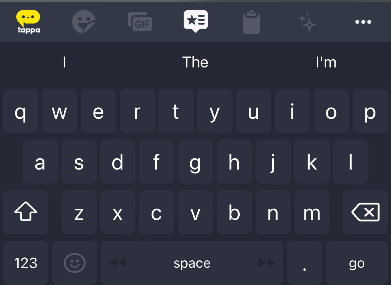
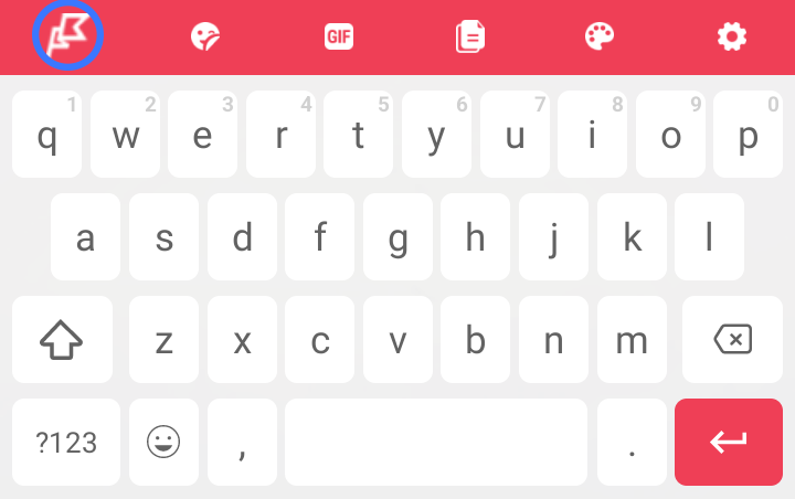
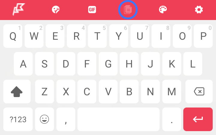
The keyboard toolbar buttons help to enrich the user experience by adding new functionality to the keyboard. They are shown on toolbar just above the keyboard itself:

There are multiple ready to use buttons. It is also possible to create custom buttons.
Customizing the Toolbar Buttons
Customization and display of toolbar buttons is performed by adding a toolbar JSON file and adding necessary dependencies.
The Toolbar JSON File
In order to change the buttons which are displayed on the toolbar first place a filed called KBToolbar.json in the application assets directory.
[
{
"order": 0,
"buttonType": "brand",
"useTint": false,
"iconResource": "kb_toolbar_items_logo",
"url": "https://www.google.com"
},
{
"order": 1,
"buttonType": "gifs",
"useTint": true,
"iconResource": "kb_toolbar_items_repository_1"
},
{
"order": 2,
"buttonType": "emoji",
"useTint": true,
"iconResource": "kb_toolbar_items_repository_1"
},
{
"order": 3,
"buttonType": "stickers",
"useTint": true,
"iconResource": "kb_toolbar_items_repository_2"
},
{
"order": 4,
"buttonType": "socialHub",
"useTint": true,
"iconResource": "kb_toolbar_items_repository_3",
"include": [
"twitch",
"tiktok",
"facebook",
"instagram",
"rss"
],
"title": "social hub title"
},
{
"order": 5,
"buttonType": "speechToText",
"useTint": true,
"iconResource": "tappa_speech_to_text_toolbar_button"
},
{
"order": 6,
"buttonType": "tappaText",
"useTint": true,
"iconResource": "mocha_tappa_text_icon"
},
{
"order": 7,
"buttonType": "themes",
"useTint": true,
"iconResource": "kb_toolbar_items_repository_5"
},
{
"order": 8,
"buttonType": "webLink",
"useTint": true,
"iconResource": "mocha_tappa_browser_toolbar_button",
"url": "https://www.tappa.com/",
"title": "tappa_weblink_title"
},
{
"order": 9,
"buttonType": "webLink",
"useTint": true,
"iconResource": "mocha_tappa_browser_toolbar_button",
"url": "https://www.tappa.com/",
"title": "tappa_weblink_title",
"urlType": "webUrl"
},
{
"order": 10,
"buttonType": "webLink",
"useTint": true,
"iconResource": "mocha_tappa_browser_toolbar_button",
"url": "tappa://keyboard",
"title": "tappa_weblink_title",
"urlType": "deeplinkUrl"
},
{
"order": 11,
"buttonType": "settings",
"useTint": true,
"title": "Settings"
},
{
"order": 12,
"buttonType": "clipboard",
"useTint": true,
"title": "Clipboard"
},
{
"order": 13,
"buttonType": "embeddedBrowser",
"useTint": true,
"title": "tappa_browser_title"
},
{
"order": 14,
"buttonType": "fixWithAI",
"useTint": true,
"title": "tappa_fix_with_ai_toolbar_button"
}
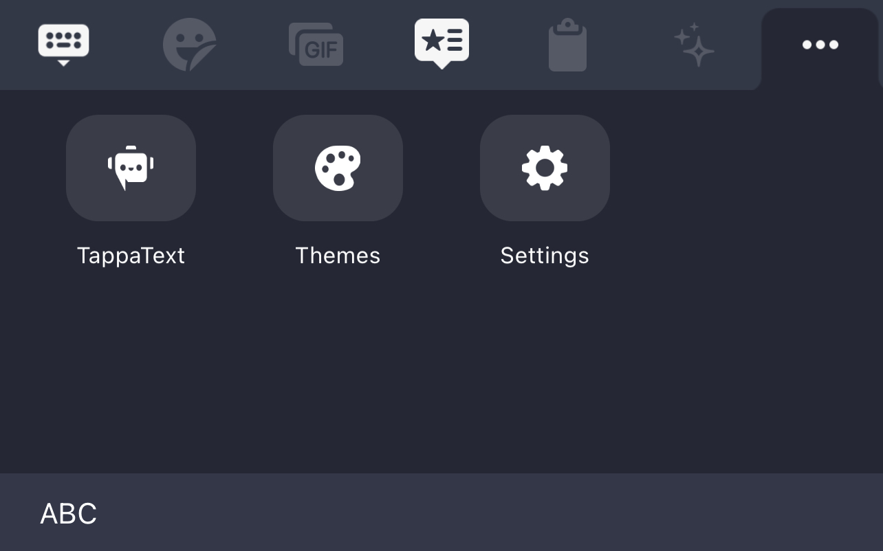
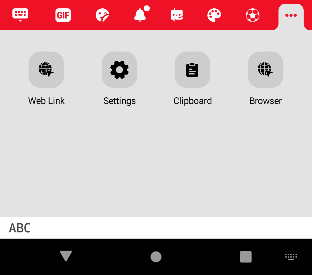
]If you have too many buttons in the toolbar (more than 7 on iOS, 8 on Android), the last one will be replaced by an ellipsis. Tapping on this ellipsis will display the remaining toolbar buttons in the keyboard view.
The JSON file can then be customized to change which toolbar buttons get displayed. The following properties are supported for each button defined in the JSON file:
| Property | Type | Description |
|---|---|---|
| order | Integer | The display order of the button |
| buttonType | String | The type of button to display |
| useTint | Boolean | Display button tint |
| iconResource | String | Name of the button resource to display |
| include | String Array | Types of content to include for certain buttons |
| title | String | Button title |
Adding Button Dependencies
Once the toolbar JSON file is created the following dependencies must be added to the application build.gradle if any of the following buttons are used to ensure the button can be loaded. Using this mechanism ensures that the SDK size is smaller and only required button functionality is added.
| Button Type | Dependency |
|---|---|
| brand | implementation "com.mocha.keyboard:brand-logo-button:$SDK_VERSION" |
| clipboard | implementation "com.mocha.keyboard:clipboard-button:$SDK_VERSION" |
| socialHub | implementation "com.mocha.keyboard:social-hub:$SDK_VERSION" |
| themes | implementation "com.mocha.keyboard:themes-button:$SDK_VERSION" |
| webLink | implementation "com.mocha.keyboard:web-link-button:$SDK_VERSION" |
| fixWithAI | implementation "com.mocha.keyboard:fix-with-ai-button:$SDK_VERSION" |
| speechToText | implementation "com.mocha.speech-to-text-button:$SDK_VERSION" |
| deeplink | implementation "com.mocha.deeplink-button:$SDK_VERSION" |
Button Types
Brand Logo Button
Opens a pre-defined URL, usually your web-site. It should have an icon with your company's brand.
When some other button on toolbar is pressed, the brand button transforms to a 'keyboard' icon, allowing the user to return back to keyboard.
The brand button should occupy the first place on the toolbar, otherwise an exception will be thrown.
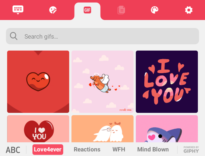
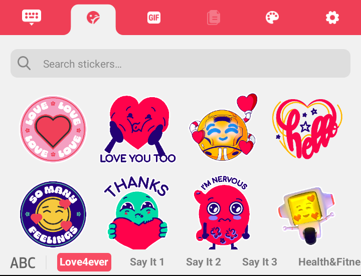
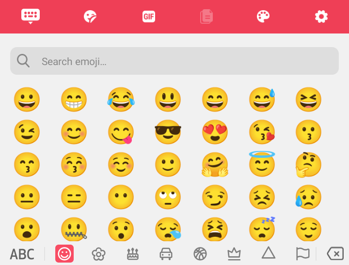
GIFs / Stickers / Emoji Button
These buttons allow sending reactions using GIFs (animated images), stickers (static images) and emojis. Gifs and stickers buttons can be used only when the text field supports them, otherwise the buttons will be disabled.
GIFs:
Stickers:
Emojis:
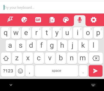
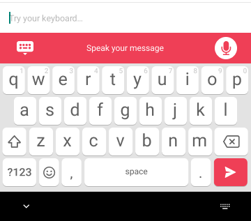
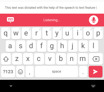
Speech To Text
Enhance your typing efficiency with the Keyboard SDK's speech-to-text functionality. Simply tap the microphone icon to activate voice recognition and start dictating your message. The SDK accurately transcribes spoken words into text in real-time, allowing for hands-free messaging and improved multi-tasking capabilities.
To incorporate the speech-to-text functionality into your Android keyboard application using the SDK, you need to add to the KBToolbar.json configuration file the following JSON object:
{
  "order": 5,
  "buttonType": "speechToText",
  "useTint": true,
  "iconResource": "tappa_speech_to_text_toolbar_button"
},
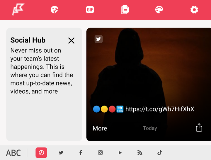
Social Hub Button
This button shows the latest posts and videos from social media:
The following sources are supported:
- YouTube
- Twitch
- RSS
- TikTok
Filtering Content
By default, all types of content is shown. It is possible to filter content by using the include parameter in the JSON:
[
  {
    "order": 3,
    "buttonType": "socialHub",
    "useTint": true,
    "iconResource": "kb_toolbar_items_repository_3",
    "include": [
      "twitch",
      "tiktok",
      "facebook",
      "instagram"
    ],
    "title": "social hub title"
  }
]
It's possible to use several social hub buttons in a single configuration with differentincludeparameters.
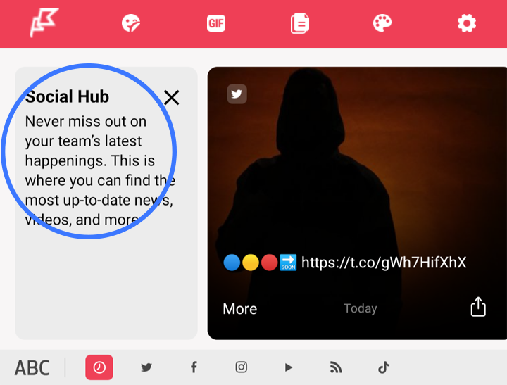
Info card
The info card describes to users what the button does. It's shown 3 times, unless closed explicitly by user, in which case it won't be shown anymore. It has a title and a description.
Clipboard Button
This button allows users to paste text from clipboard. Initially, when no text is copied, the button is disabled:
When some text is copied by the user, the toolbar changes its state to show the text:
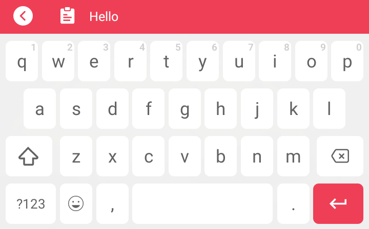
When the text is tapped, it is pasted into the active text field and the state changes back to show the toolbar buttons, and the button is enabled:
When the button is tapped, the text is copied to text field again.
Themes Button
This button allows the user to view keyboard themes and change the active theme.
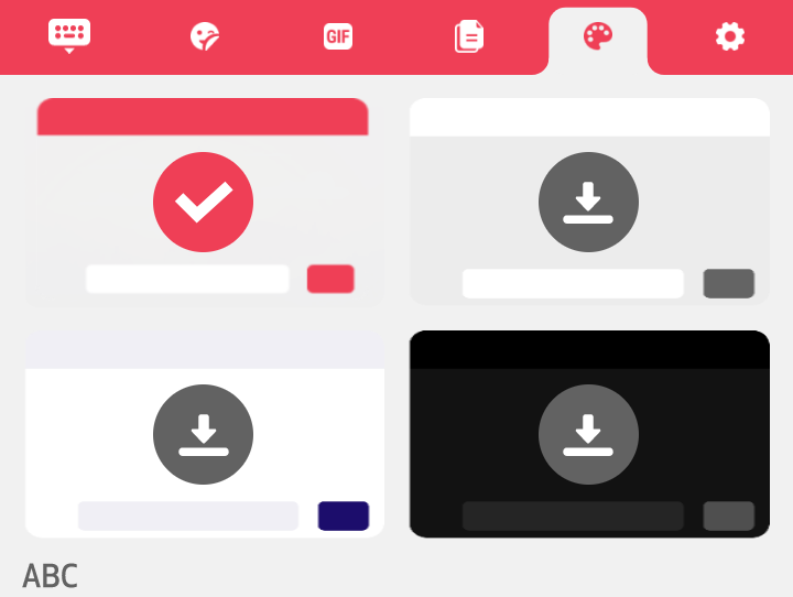
When a theme is tapped, the theme picker dialog is shown:
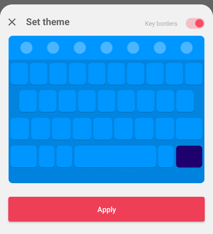
Each theme comes in 2 variants: with key borders, and without key borders. Users can choose the theme via the switch control in the theme preview screen.
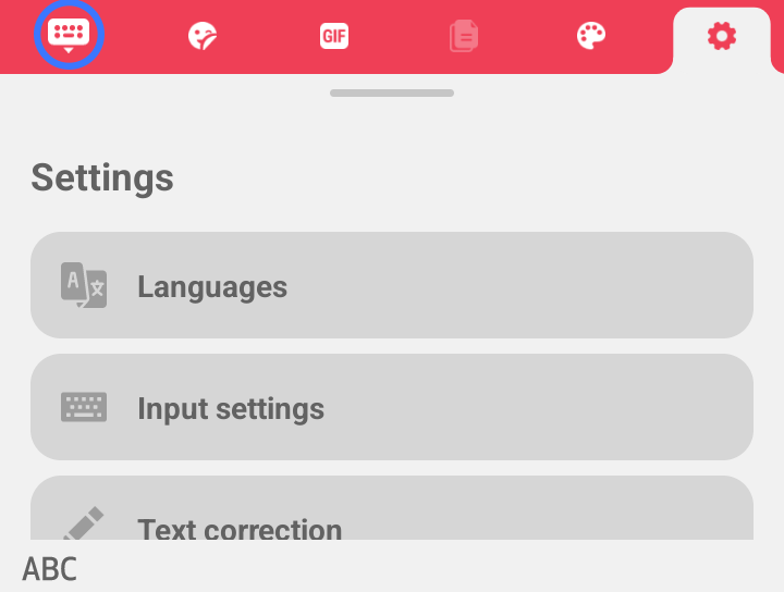
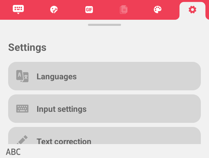
Settings Button
This button allows users to change the keyboard settings.
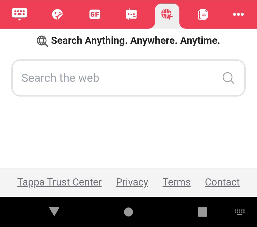
Embedded Browser Button
This button displays an embedded web browser to the user, allowing the user to navigate the web directly from the keyboard.
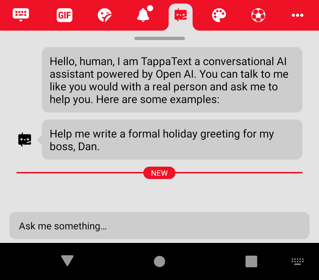
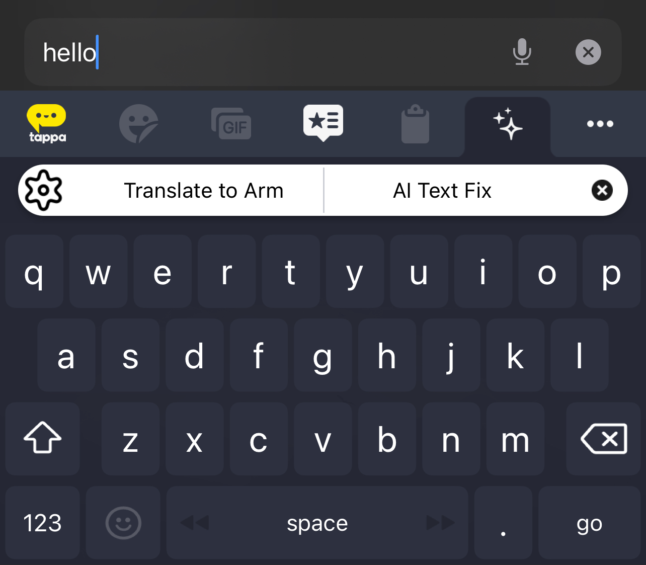
Tappa Text Button
This button provides the user the ability to ask questions and make prompts and receive responses from an AI chatbot powered by ChatGPT.
Web Link Button
The web link button launches the device web browser with the URL link which is supplied as part of the button configuration.
Fix with AI
Fix with AI allows you improve the text you are currently typing and also to translate it in any languages.
Please note that, Fix with AI will always be displayed as:
- the last button of the keyboard if the ellipsis is not displayed.
- the penultimate button of the keyboard if the ellipsis is displayed.
This is regardless of the order set in the JSON file.
Updated over 1 year ago